A primary logo may be wonderful but if it isn’t flexible, it can damage the brand experience. Having multiple versions of the logo can help elevate a brand and keep consistency across all platforms and media.
Consider the importance of scalability: different platforms and media outlets have distinct size and layout requirements. By having variations of your logo tailored to fit these specifications, you guarantee that your brand’s visual identity remains clear and impactful, whether it’s on a billboard, a social media, or a business card.
Another crucial aspect is legibility. In some instances, a simplified version of your logo without intricate details may be necessary to ensure clarity and visibility, especially in smaller sizes or unconventional placements. A streamlined logo can enhance readability and recognition, making it easier for your audience to connect with your brand effortlessly.
If you want your business to show up and stand out, you need a set of logo variations.
What is a logo variation?
A logo variation is a rearranged version of the primary logo design. Having a unique set of logo designs ensures the branding is flexible, versatile, and recognisable in different placements.
For example, if you only have one large horizontal logo, how can it work as profile picture on your social media?
Let’s take a look at the 3 different logo variations that every brand needs to complete its brand identity.
Primary logo
A primary logo is the main logo used to represent a brand. All other brand logos come from this primary logo design.
Primary logos are the most extensive of all brand designs and include the full business name, tag-line, website, geographic location, date, illustrations etc.
The main logo is used in places with lots of space, like website header and large print collateral.

Primary logos
- are used most of the time
- include full business name
- may include tag-line, website, geographic location, date, illustrations etc.
Secondary logo
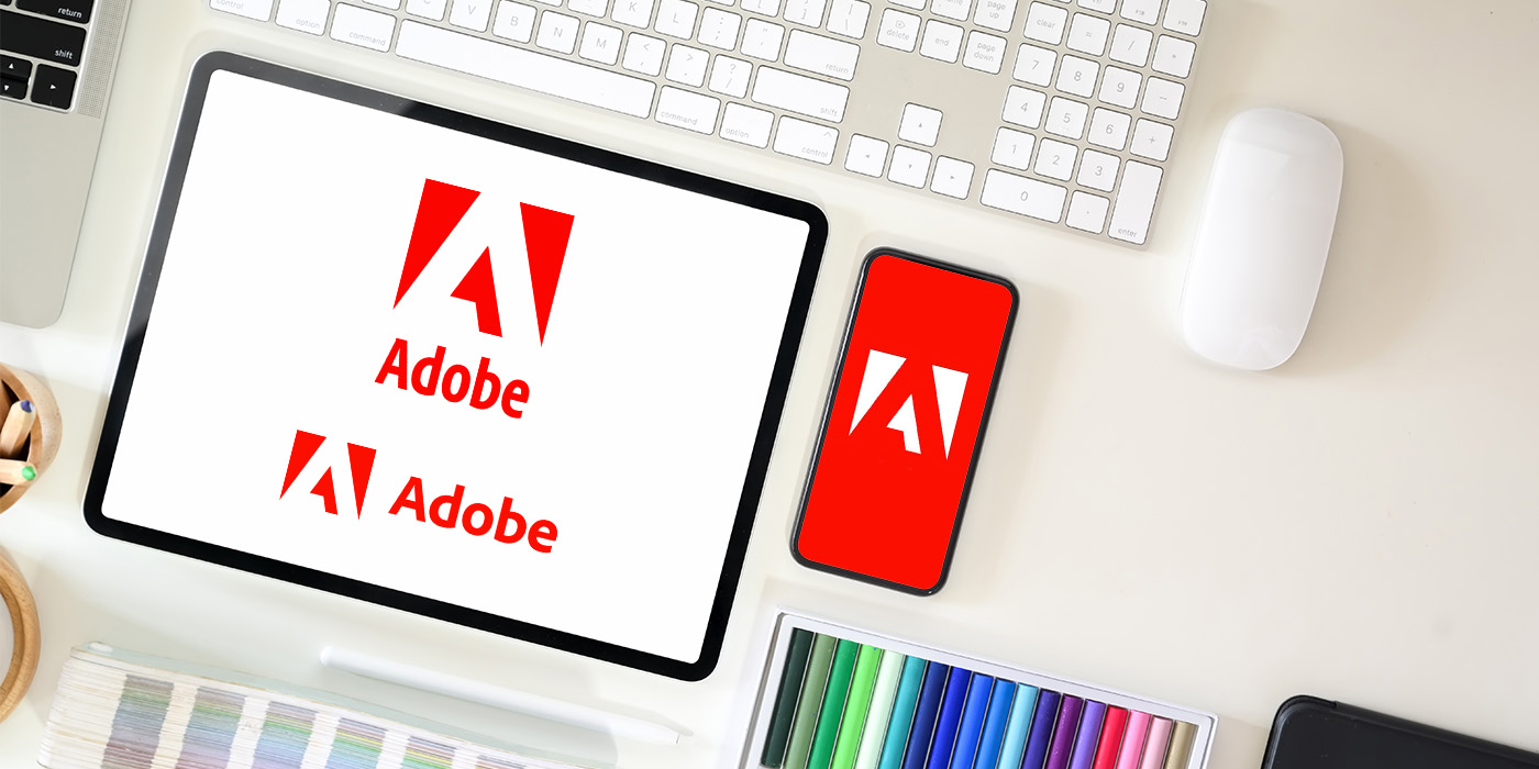
The secondary logo is usually a simplified version of the primary logo rearranged into another orientation. So, if the primary logo is horizontal, the secondary logo could be a stacked version.
It’s helpful to have a secondary logo to use in places where the horizontal logo may not fit or be legible if reduced in size.
A secondary logo is great for smaller print collateral pieces and social media.

Secondary logos
- are simplified design and text
- are used on small format
- includes full business name
Sub-mark logo/Icon
A sub-mark logos or icons are a stripped down graphic of the main logo. Those logos typically do not include text or the full name of the business. Icons are a subtle way to add branding to a graphic that will already be seen in context with the main logo.
Sub-marks are used when the design must be resized to extremely small formats or to help communicate the brand quickly; e.g. social media, website and email footer.

Sub-mark logo/Icon
- are commonly used online and on social media
- are used when logo is resized to extra small formats
- includes single letters, numbers, or a symbol
Having multiple versions of a logo isn’t just a matter of aesthetic variety; it’s a strategic approach to maintaining brand consistency and visibility across the expansive landscape of media and platforms. Each iteration serves a specific purpose, ensuring that the brand remains versatile, recognisable, and effective in conveying its message across diverse channels.
If your business doesn’t have these things, it’s worth thinking about. Imagine where your logo could go if you had different versions of it.
Share this article
Recent Posts

By using smart job hunting methods and preparing for interviews, you'll easily find your way through the changing world of graphic design jobs, bringing you closer to your creative career dreams.

A great CV or resume helps you give context to your work and provide additional details about your skills and experience.
Resources

Free Graphic Design CV Template
Provide prospective employers with a glimpse of your skills and demonstrate your design mastery using my captivating graphic design resume template.
Blog
Next article

Appropriateness, simplicity, and memorability are the 3 pillars that transforms a logo from ordinary to extraordinary.

