Understanding the Gestalt Principles of Design is crucial for any graphic designer aiming to create visually compelling and intuitive work. Rooted in psychology, these principles explain how our brains perceive and process visual information, enabling designers to craft designs that are not only aesthetically pleasing but also functional and user-friendly.
The Gestalt principles originated in the early 20th century with a group of German psychologists, including Max Wertheimer, Kurt Koffka, and Wolfgang Köhler. They sought to understand how people naturally organise visual elements into coherent groups. By studying perception and human behaviour, they formulated principles that describe how we interpret complex images and patterns. These principles provide a framework that helps designers create work that resonates deeply with viewers and enhances their overall experience.
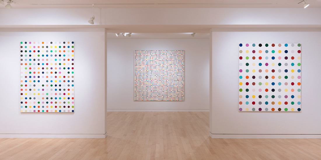
As we explore these principles, it’s fascinating to see them in action in contemporary art. Take Damien Hirst’s Spot Paintings—a perfect illustration of Gestalt principles at work. These works, characterised by their orderly grids of coloured spots, draw heavily on the way we naturally organise visual information.
1. Principle of Prägnanz
At the heart of Gestalt theory lies the principle of Prägnanz, which suggests that we inherently perceive objects in their simplest, most straightforward form. This principle is foundational in design, guiding us to create layouts that are clear and unambiguous.
For example, a well-designed logo often relies on this principle, using minimalistic elements to convey a brand’s identity effectively. By focusing on simplicity and clarity, designers can ensure their work communicates efficiently with its audience.

2. Principle of Similarity
Similarity is a powerful tool in design, as it allows us to group elements based on shared characteristics such as colour, shape, or size. This principle helps in creating a cohesive look and feel, making it easier for viewers to understand the relationship between different parts of a design.
Damien Hirst’s Spot Paintings exemplify this principle—each spot is identical in shape and evenly spaced, encouraging viewers to perceive them as a collective whole rather than as individual elements. This use of similarity unifies the composition, mirroring how this principle is applied in design to create harmony and coherence.

3. Principle of Proximity
The principle of proximity states that objects that are close to each other are perceived as a group. This is particularly useful in layout design, where grouping related elements can help organise information and improve readability.
For instance, in a magazine layout, grouping related text blocks and images together in close proximity can help readers easily identify which visuals relate to which articles, creating a clear and organised flow of information. By strategically placing related items near each other, designers can create a logical structure that guides the viewer’s eye through the content, making it easier to digest and understand.

4. Principle of Continuity
Continuity suggests that our eyes naturally follow lines and curves, preferring smooth, continuous paths. This principle can be used to guide the viewer’s attention through a design, ensuring they notice the most important elements.
For example, in a website design, the use of diagonal or curved lines to separate sections of content can create a continuous visual pathway, leading the viewer from one section to another in a seamless and engaging manner. This application of continuity ensures that the user’s journey through the site feels natural and intuitive, keeping them engaged with the content.

5. Principle of Closure
Closure is the concept that our brains fill in missing information to create a complete image. This principle can be particularly impactful in logo design, where partial shapes or incomplete forms prompt viewers to perceive a whole.
The famous WWF panda logo is a classic example, where minimal lines are enough to convey the complete image of a panda, engaging the viewer’s imagination and making the design memorable.

6. Principle of Common Region
According to this principle, elements located within the same bounded area are perceived as a group. Designers can use this to their advantage by creating clear boundaries around related elements, such as using boxes or shaded backgrounds to highlight important sections.
This helps in differentiating parts of a design and can be especially useful in interfaces, where distinct regions can improve user navigation.

The Gestalt Principles of Design offer invaluable insights into human perception, enabling designers to create work that is both beautiful and functional. By applying these principles—Prägnanz, Similarity, Proximity, Continuity, Closure, and Common Region—designers can craft visuals that communicate more effectively and resonate with their audience.
As demonstrated by Damien Hirst’s Spot Paintings, these principles transcend traditional design, permeating art and altering our understanding of visual perception. Mastering these principles not only enhances the aesthetic quality of a design but also its usability, making it a cornerstone of successful graphic design.
Share this article
Recent Posts

Design isn’t just what you see—it’s how it works, and how it makes you feel.

There is a very big misunderstanding about what a brand is. A brand is what sets your business apart. It's the unique personality and values that people remember.
Resources

Free Graphic Design CV Template
Provide prospective employers with a glimpse of your skills and demonstrate your design mastery using my captivating graphic design resume template.
Blog
Next article

Understanding the Real Role of Designers in Brand Creation.

