Imagine a logo as a helpful sign guiding people to discover and recognise a business. Surprisingly, there are 7 main different types of logos, each blending typography and images to give a unique look and feel to a brand.
Since the logo is a crucial element of a business’s visual identity, making the right choice is very important. Logos help businesses share their unique style and message. Picking the right logo is like choosing the perfect outfit – it says a lot about the brand.
Each logo type has specific traits and characteristics, so it’s important to know them all.
1. Monogram (or Lettermark)

A monogram or lettermark is a typography-based logo that’s composed of a few letters, usually the company’s initials.
The lettermark is all about simplicity; by utilising just a few letters, lettermark logos are effective at streamlining any company brand, if they have a long name. For example, is much easier to remember BBC rather than British Broadcasting Corporation.
Consider a monogram if your business happens to have a long name. Condensing the business name into initials will help simplify the design and customers will have an easier time recalling a business and its logo.
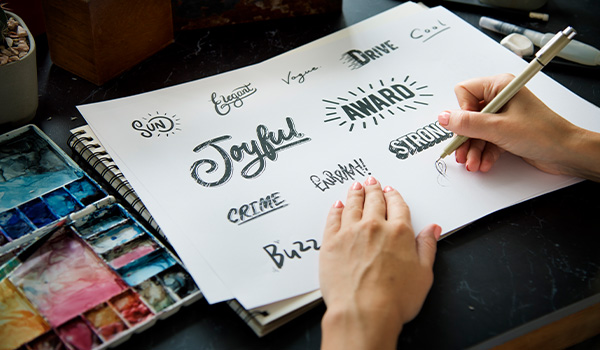
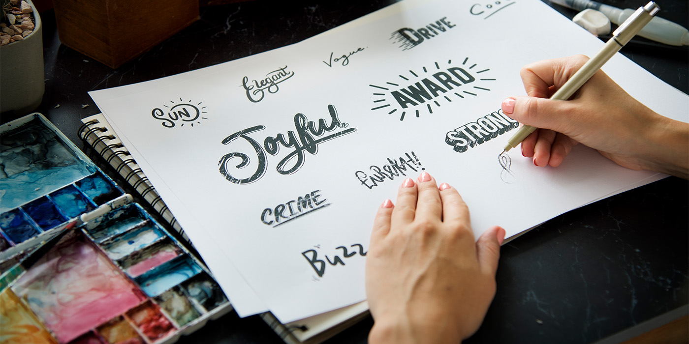
2. Logotype (or Wordmark)

Similar to a lettermark, a logotype or wordmark is a font-based logo that focuses on a business’ name alone.
Wordmark logos work really well when a company has a succinct and distinct name. When the name is catchy and memorable combined with strong typography, the logotype helps create strong brand recognition.
A logotype is a good decision for a new business that need to get its name out in the market, making sure the name is short enough to take advantage of the design. Anything too long can look cluttered.
3. Pictorial Mark (or Logo Symbol)

A pictorial mark or logo symbol is an icon or graphic-based logo.
Each of these companies’ logos is so unique, and each brand so established, that the mark alone is instantly recognisable. A pictorial mark can be tricky if you don’t have an established brand but that’s not a hard and strict rule. The use of logo symbols can help communicate what a business is and does graphically, if the name is too long, and effectively convey a desired idea or emotion.
The biggest thing to consider when deciding to go with a pictorial mark is what image to choose. The chosen image should align seamlessly with the brand identity and withstand the test of time, fostering a sense of consistency and reliability for its audience. Choosing a pictorial mark might not be the most advisable decision if alterations to the business model are expected in the future.
4. Abstract Mark

An abstract mark is a specific type of pictorial logo. Instead of being a recognisable image, like an apple or a bird, it is an abstract shape that represents a business.
The benefit of an abstract mark is that is possible to convey what a company does symbolically, without relying on the cultural implications of a specific image, allowing to create something truly unique to represent the brand. By utilising colour and form, one can attribute meaning and cultivate emotion around the brand.
5. Mascot

Mascots are logos that involve an illustrated character. Often colourful, sometimes cartoonish, and fun, the mascot logo serves as an excellent method for businesses to establish their very own brand spokesperson.
A mascot is simply an illustrated character that represents a company. Think of them as the ambassador of the business.
Mascots are great for companies that aim to create a wholesome atmosphere, appealing to families and children. One significant benefit of a mascot is that it can encourage customer interactions, making it a valuable tool for social media marketing as well as real-world marketing events.
6. Emblem

An emblem logo is a type of logo where the business name is encased within a symbol or an icon, creating an unified and cohesive design. Typically, the text and the symbol are intricately intertwined, often within a shield, crest, or a defined shape. Emblems often convey a sense of tradition, authority, or heritage due to their historical associations with crests and badges. They are commonly used by schools, government organisations, and entities that want to evoke a sense of prestige and tradition. While they maintain a classic style, some companies have effectively modernised the traditional emblem look with logo designs fit for the 21st century.
An emblem’s traditional look might be favoured by many public agencies and organisations, but it can also serve any private business quite well, especially those in the food and beverage industry. Emblem logos shouldn’t incorporate too many details; an intricate design may prove challenging to replicate across all platforms and media.
7. Combination Mark

A combination mark is a logo that combined a logotype or lettermark and a pictorial mark, abstract mark, or mascot. The picture and text can be laid out side-by-side, stacked on top of each other, or integrated together to create an image.
Because the name is associated with the image, a combination mark is a versatile choice, where both the text and icon or mascot work together to reinforce the branding. With a combination mark, people will quickly associate the name with a pictorial mark or mascot. In the future, it would be possible to rely exclusively on the symbol without including the name.
A combination mark is a great choice for pretty much any business: it’s versatile, usually highly unique, and the most popular choice of logo among prominent companies.
Regardless of a company’s size or longevity in the market, the need for a well-crafted logo is universal. Logos act as powerful tools, resonating with audiences and contributing to the establishment and definition of a brand in the competitive business environment. Every business, from fledgling startups to seasoned enterprises, requires a distinctive logo to stand out and make their brand memorable.
Share this article
Recent Posts

A logo is a simple and functional signpost to help people find and identify a business. But did you know there are 7 different logo styles?

Design has the power to guide, persuade, and sometimes mislead. As designers, how do we know when we’ve crossed the line between influence and manipulation?
Resources

Free Graphic Design CV Template
Provide prospective employers with a glimpse of your skills and demonstrate your design mastery using my captivating graphic design resume template.
Blog
Next article

Unlock the keys to business success through effective pricing. Explore the dynamic options of hourly rates and project pricing for sustained success.

