The Project
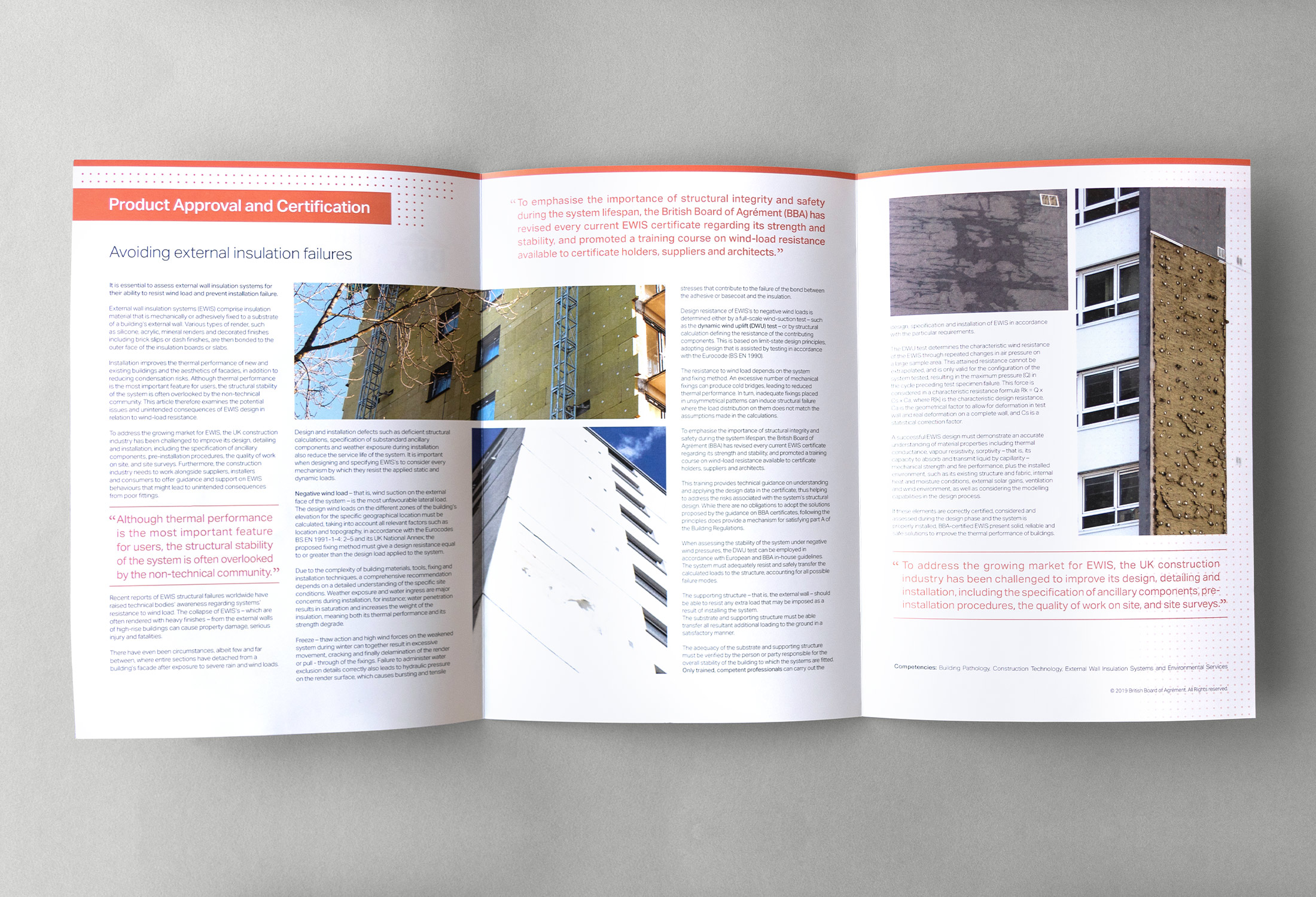
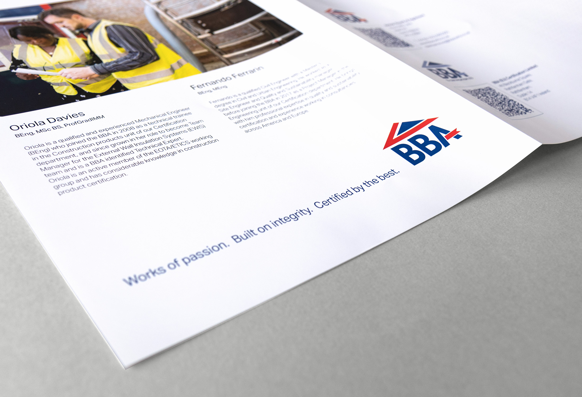
BBA Brand Collaterals

The BRIEF
Developing a cohesive visual identity framework
The British Board of Agrément (BBA) stands as the preeminent construction testing facility in the UK. In my role within the marketing team, I played an integral part in orchestrating the development of a new brand identity and led the redesign of the company’s marketing materials.
The CHALLENGE
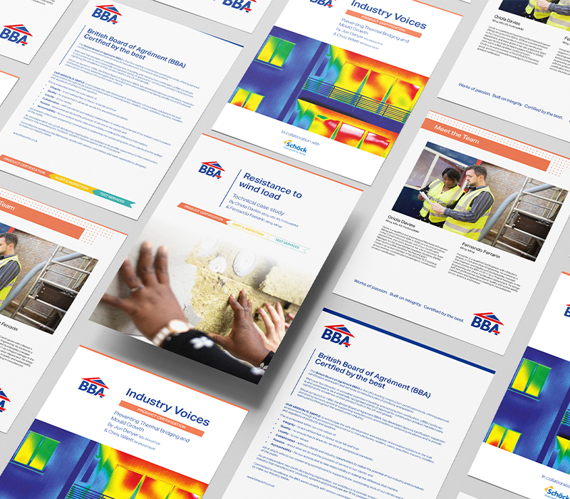
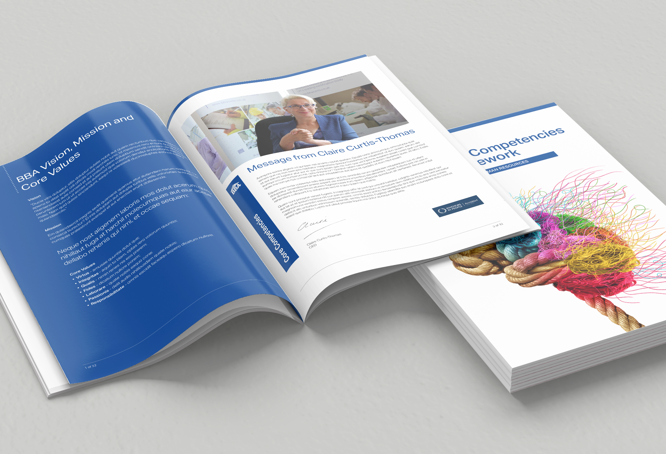
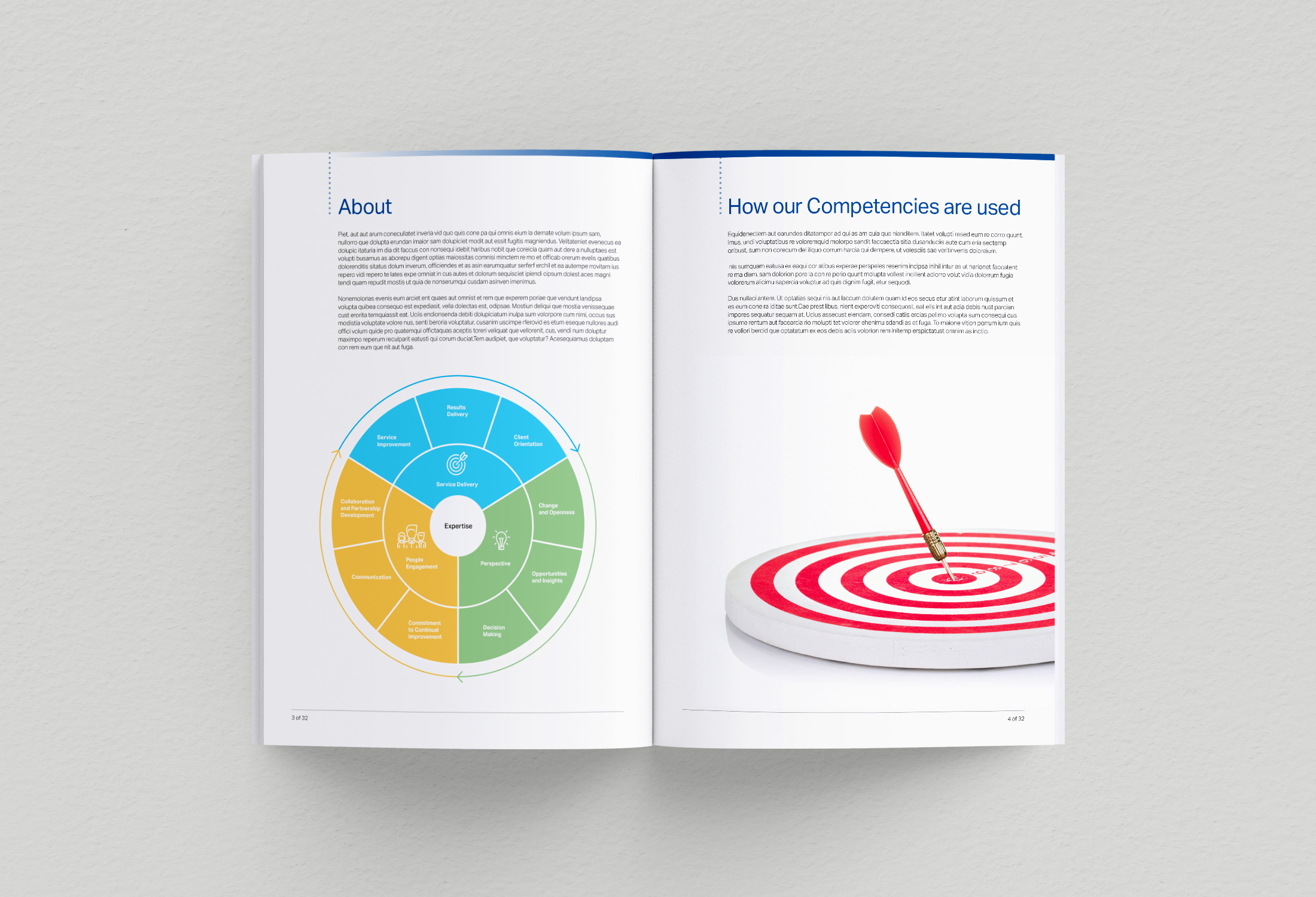
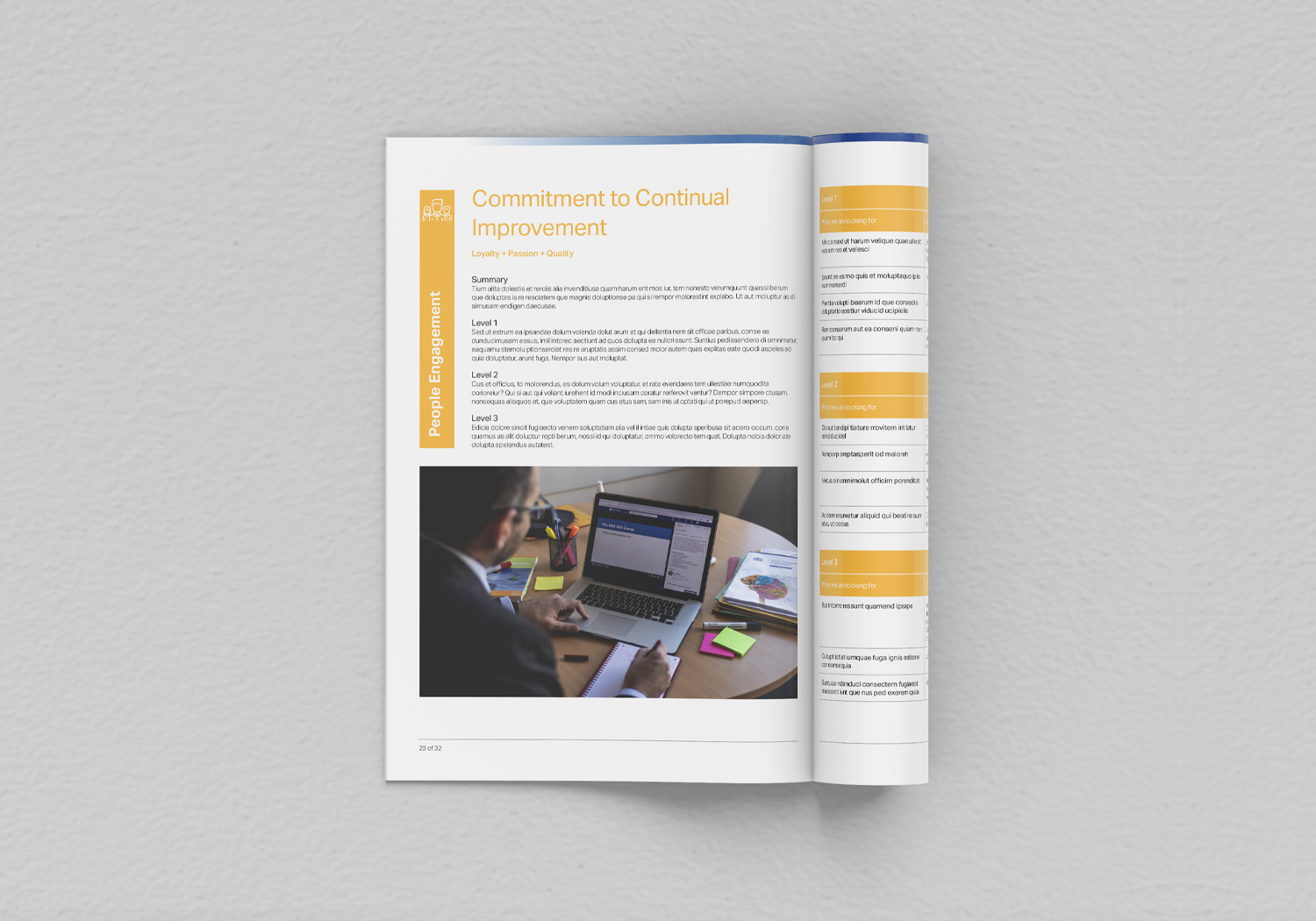
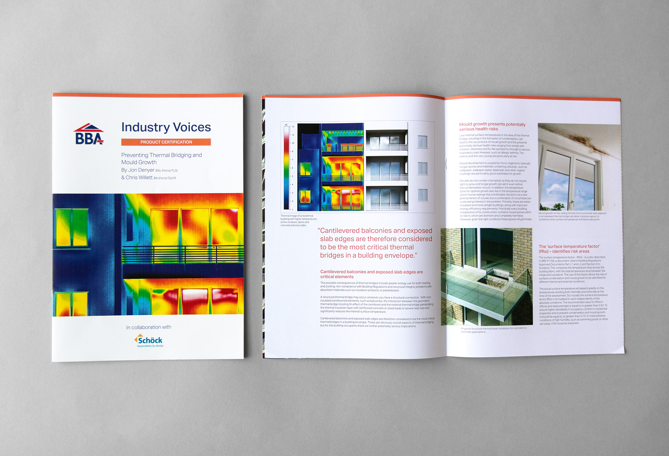
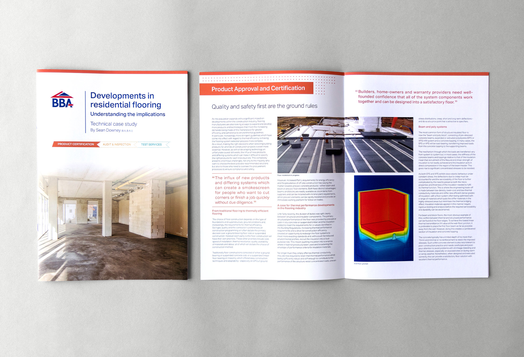
Utilising the brand guidelines, I undertook the task of establishing a cohesive visual system that maintained consistency across all marketing materials. This involved not only redesigning existing assets but also developing new materials to align seamlessly with the established brand identity.
STRATEGY AND APPROACH
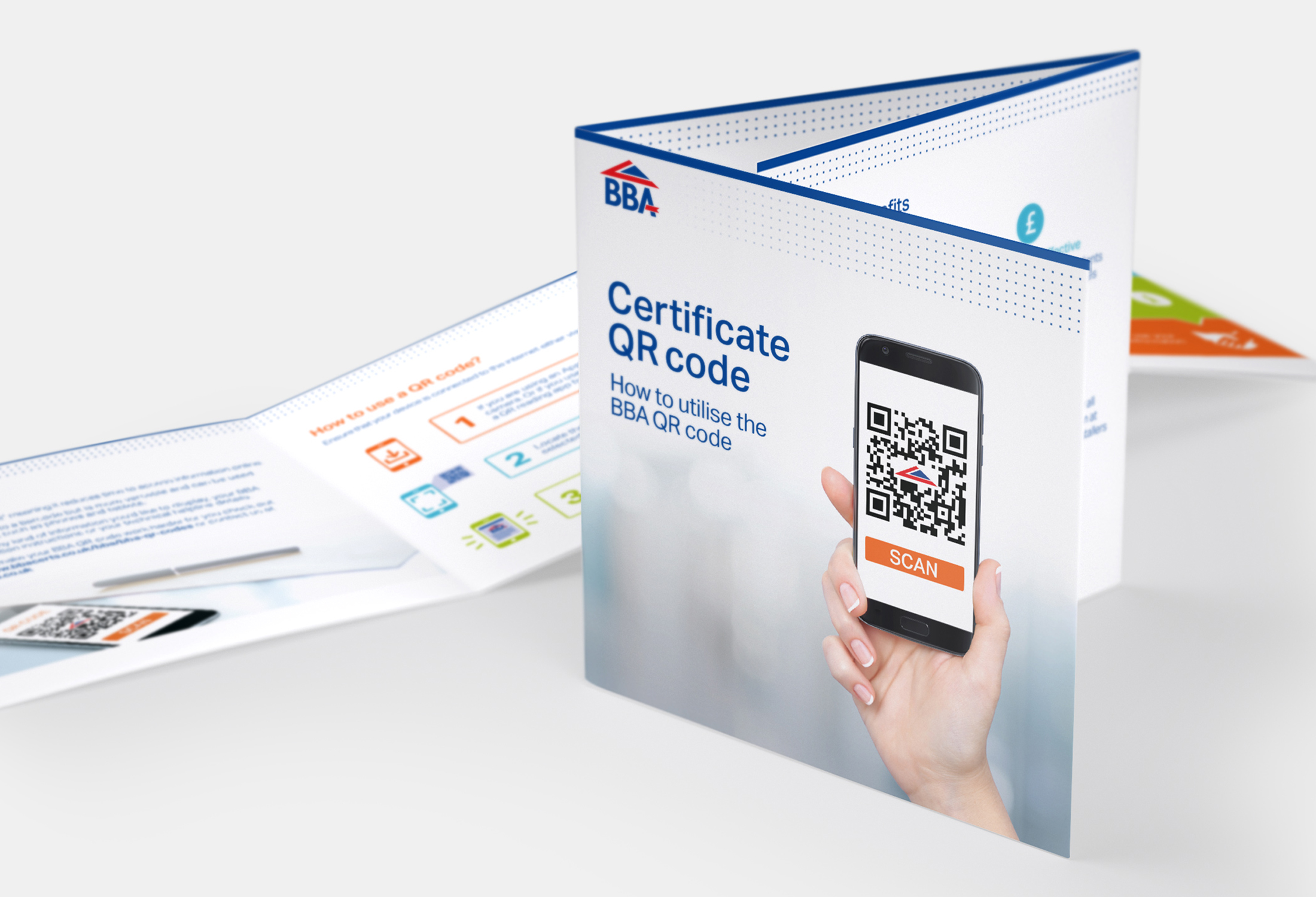
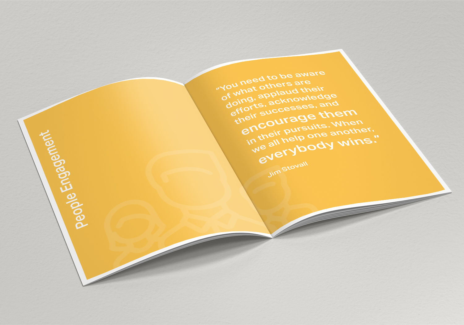
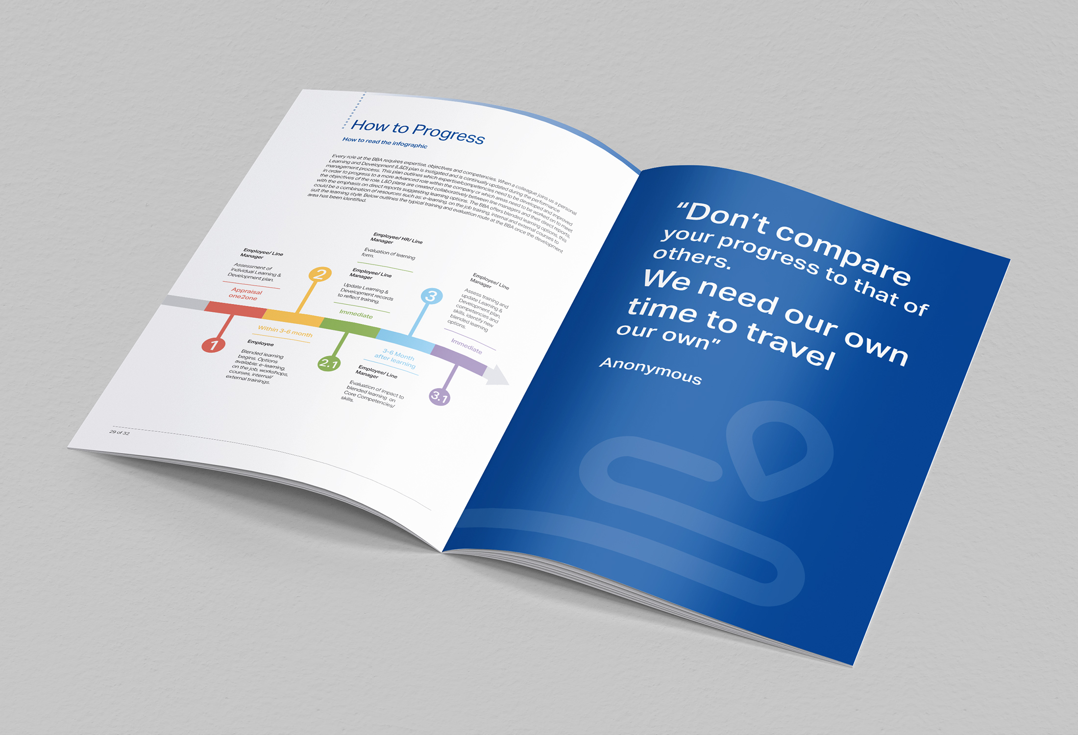
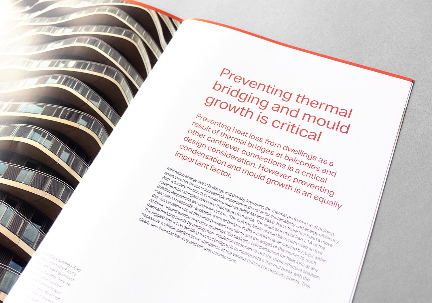
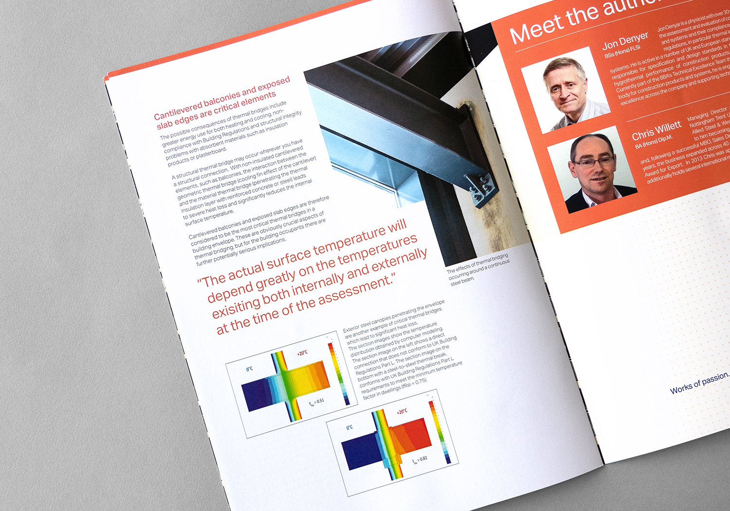
To enhance the BBA’s brand, I carefully studied its existing guidelines and created a consistent visual style that feels both modern and authoritative. Using bold typography, asymmetrical layouts, and dynamic elements, I ensured all marketing materials—from brochures to digital content—had a unified look and feel. Collaborating closely with stakeholders, I fine-tuned the design to meet practical needs and resonate with the target audience. This cohesive approach has strengthened the BBA’s identity, helping it connect with a wider audience and grow within the construction testing sector.

RESULT
The refined visual identity, characterised by bold, stimulating typography, an asymmetrical structure, and a dynamic flowing experience, has facilitated the company’s evolution and expansion, allowing it to effectively engage a broader audience.

