The Project
HHC Logo Design
The BRIEF
Logo redesign and brand guidelines
Harrow Hockey Club (HHC) is well-known in its community for its strong tradition and dedication to the sport. It has a long history of being one of the best hockey clubs around, attracting both players and fans who appreciate the game. The club is now looking to update its logo to better represent its energetic and forward-thinking nature. I’m excited to take on this project and create a new emblem that honours the club’s past while also fitting in with modern design trends.
Old logo
New logo

The CHALLENGE
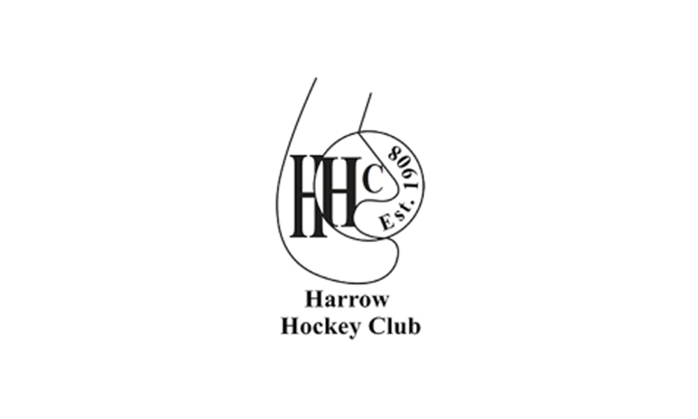
The current logo fails to distinguish itself among other hockey clubs. Its design poses readability challenges against coloured backgrounds and lacks versatility in its variations. As a result, it does not authentically represent the club’s identity or convey a professional image.
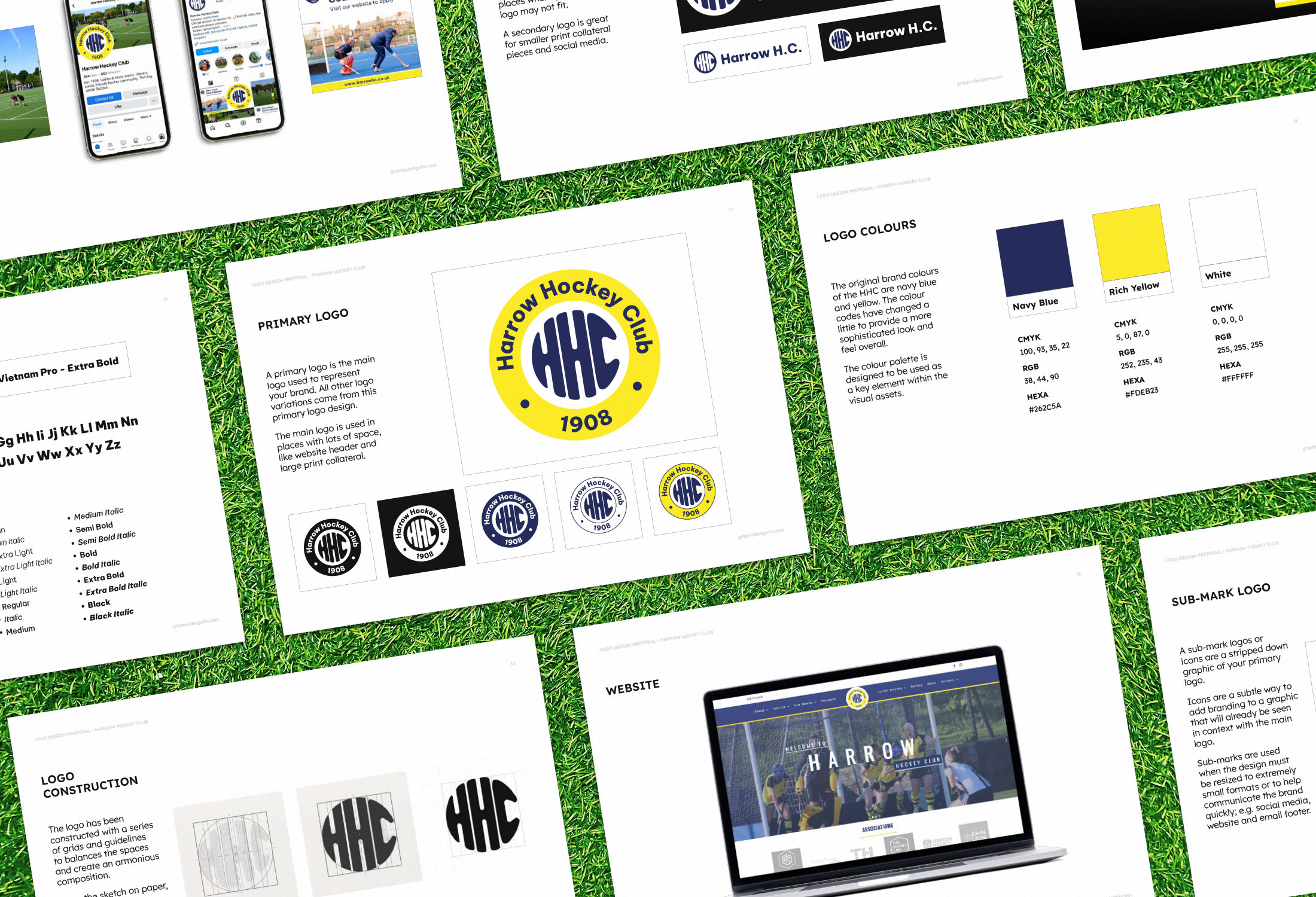
STRATEGY AND APPROACH
The objective is to develop a logo that will foster brand expansion and establish recognition across various platforms. The logo must possess strength, boldness, modernity, and relevance suitable for a hockey team.




RESULT
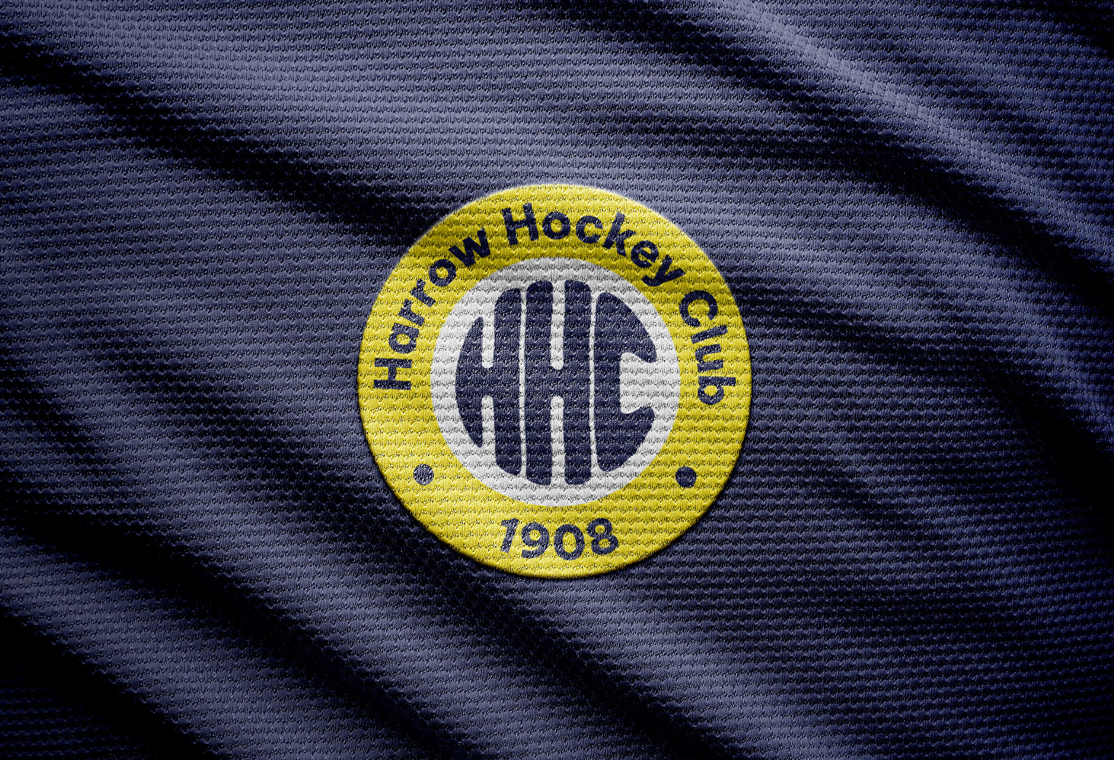
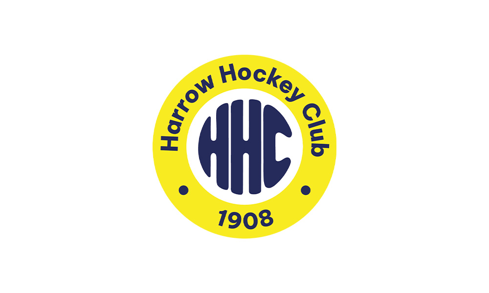
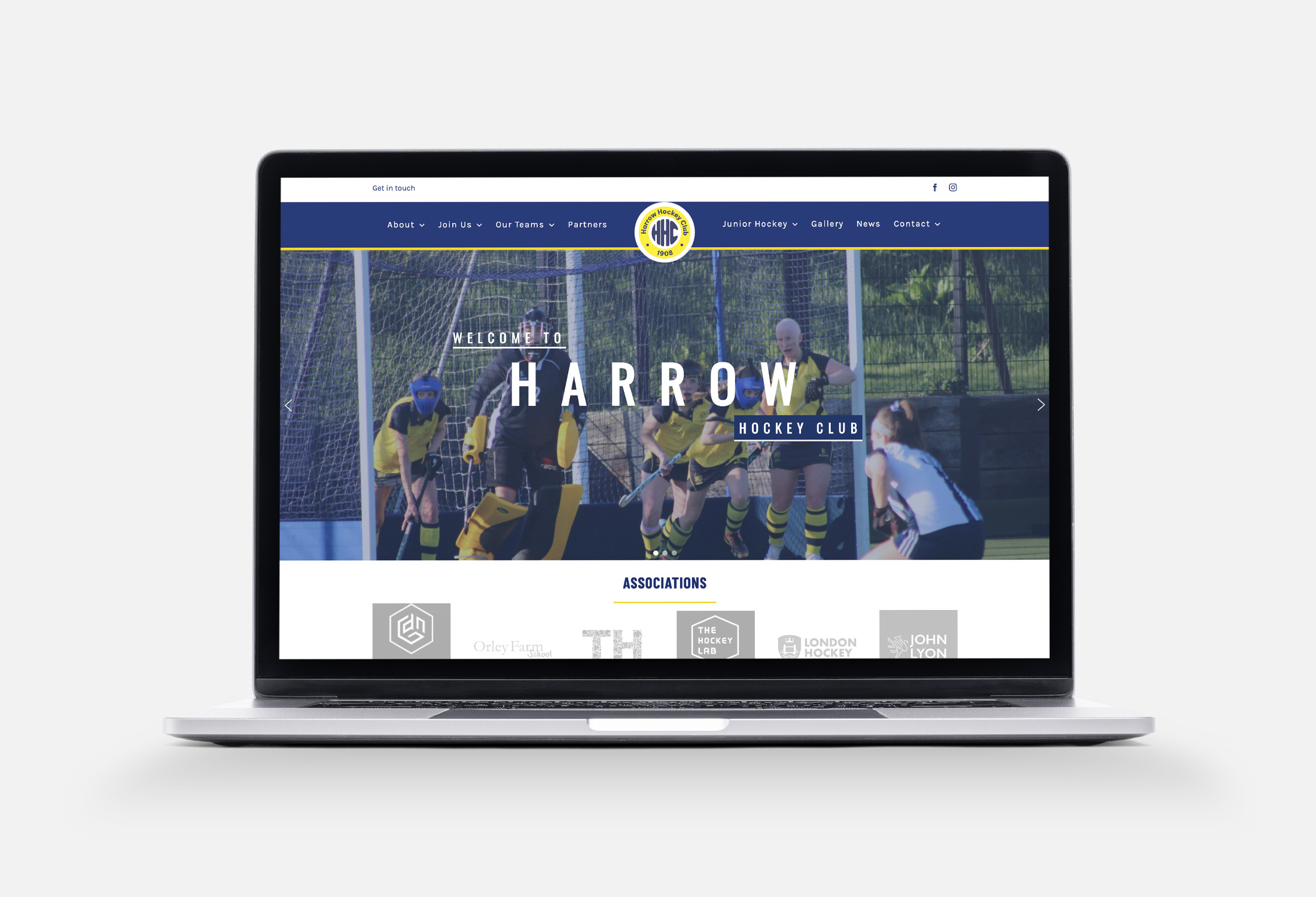
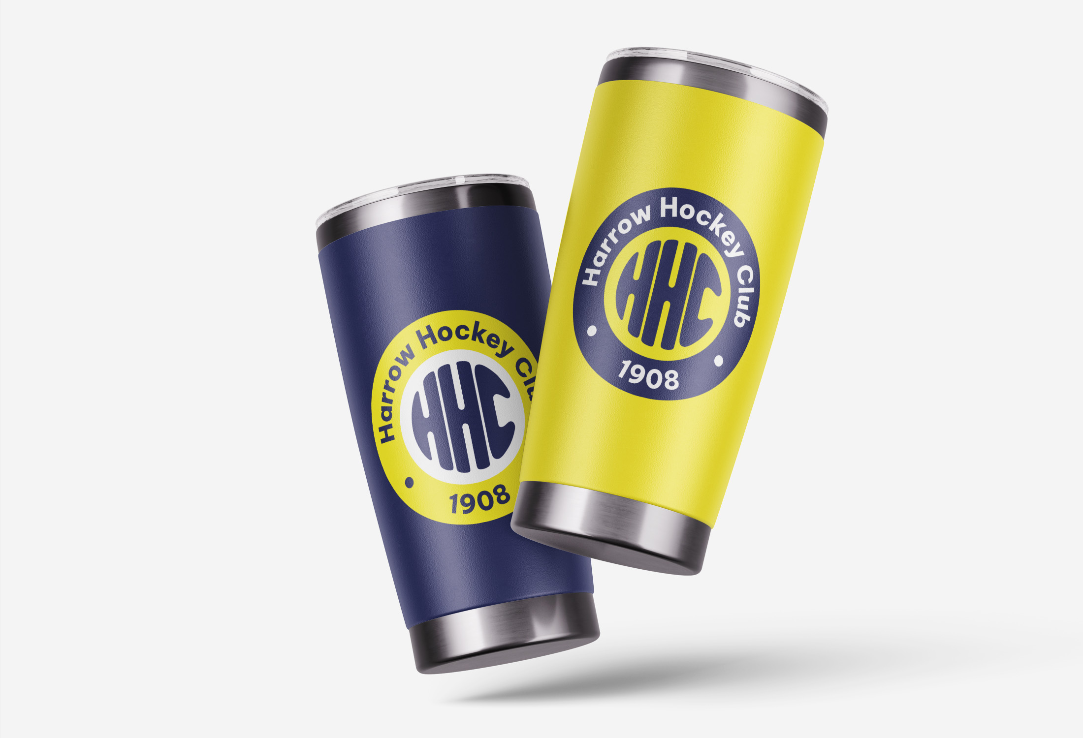
The redesigned logo serves as an emblem that pays homage to the club’s heritage while seamlessly integrating with contemporary design trends. The array of logo variations ensures adaptability across diverse applications and merchandise formats. Additionally, comprehensive brand guidelines will offer direction on the use of different assets, including a typography system and brand colours, to maintain consistency and enhance recognisability.

